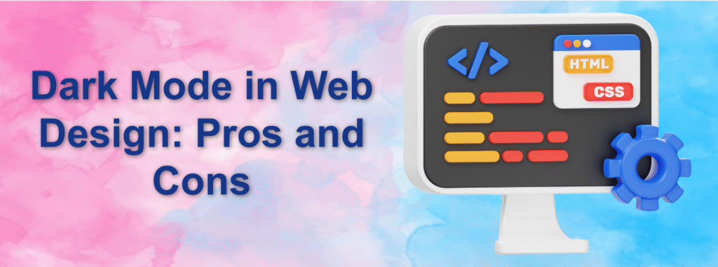
Dark mode has evolved from a niche feature into a mainstream design choice in modern websites and applications. From global tech platforms to creative portfolios and enterprise dashboards, dark-themed interfaces are now widely adopted for their visual appeal and user comfort. However, despite its popularity, dark mode is not a one-size-fits-all solution.
This article takes a closer look at the benefits and limitations of dark mode in web design and explores how it impacts usability, aesthetics, accessibility, and brand identity.
What Does Dark Mode Mean in Web Design?
Dark mode, also known as night mode, is a user interface style where darker shades—such as black, charcoal, or deep gray—form the primary background. Text, icons, and interface elements are displayed in lighter colors to maintain contrast and readability.
Unlike traditional light mode, which relies on dark text over light backgrounds, dark mode flips this contrast. The result is a visually distinct interface designed to reduce screen brightness and offer a more relaxed viewing experience, especially in low-light environments.
Benefits of Using Dark Mode in Web Design
1. Increased Visual Comfort in Dim Lighting
Dark mode minimizes screen glare, making it easier on the eyes when browsing in low-light conditions. Users who work late at night or spend long hours in front of screens often prefer darker interfaces for reduced eye fatigue.
2. Improved Battery Performance
On devices equipped with OLED or AMOLED displays, dark mode can help conserve battery life. Since darker pixels consume less power, users may notice extended usage time compared to light-themed interfaces.
3. Sleek, Modern Aesthetic
Dark-themed designs often feel premium, stylish, and contemporary. This makes dark mode especially appealing for tech companies, digital tools, creative agencies, and brands that want to convey innovation and sophistication.
4. Stronger Emphasis on Visual Content
Dark backgrounds naturally make images, videos, and graphics stand out. Designers frequently leverage this contrast to highlight important elements, create depth, and enhance visual storytelling.
5. Lower Perceived Blue Light Exposure
While not a complete remedy, dark mode can reduce the intensity of blue light emitted from screens. This may help minimize eye strain and support better viewing comfort during nighttime use.
Drawbacks of Dark Mode in Web Design
1. Eye Strain During Long Reading Sessions
For content-heavy platforms such as blogs, articles, or news websites, dark mode can sometimes reduce reading comfort. Light text on dark backgrounds may become tiring over extended periods.
2. Accessibility Concerns
Dark mode is not universally accessible. Users with certain visual impairments or contrast sensitivity issues may find dark interfaces harder to use, making accessibility testing essential.
3. Brand Identity Misalignment
Not every brand suits a dark visual tone. Brands focused on warmth, openness, simplicity, or trust—such as healthcare or education—may benefit more from light-themed designs.
4. Increased Design and Development Effort
Effective dark mode implementation requires careful planning. Colors, typography, images, shadows, and icons must be adjusted individually to ensure clarity, balance, and consistency—simple color inversion is not enough.
5. Risk of Poor Visibility
If not designed properly, dark interfaces can cause buttons, borders, or navigation elements to fade into the background, negatively affecting usability and user interaction.
Best Practices for Designing Dark Mode Interfaces
Offer User Control: Allow users to switch between light and dark modes based on their preference.
Maintain Clear Contrast: Ensure text and UI elements meet accessibility contrast standards.
Use Accent Colors Strategically: Highlight calls-to-action and navigation elements with well-chosen accent colors.
Know Your Audience: Reading-focused websites may perform better in light mode, while visual or creative platforms often benefit from dark themes.
Test Extensively: Evaluate performance across different devices, lighting conditions, and user groups.
Conclusion
Dark mode in web design is more than just a design trend—it’s a functional choice that can improve user comfort, enhance battery efficiency, and elevate visual appeal. However, it is not universally suitable for every type of website or audience.
While dark mode excels in visually rich, technology-driven, and creative environments, it may present challenges for text-heavy or accessibility-first platforms. The most effective solution lies in balance.
By understanding user behavior, aligning with brand identity, and offering both light and dark mode options, designers can deliver experiences that are visually engaging without compromising usability.
A well-executed dark mode proves that strong design is not just about appearance—it’s about thoughtful, user-centered decisions.
USEFUL LINKS:
https://awaraj.com/logo-design-services/
https://awaraj.com/web-design/
https://awaraj.com/branding-building/
https://awaraj.com/graphic-design-services/
