The Developer's Guide to iPad Kiosk UI and UX for Touch Screens
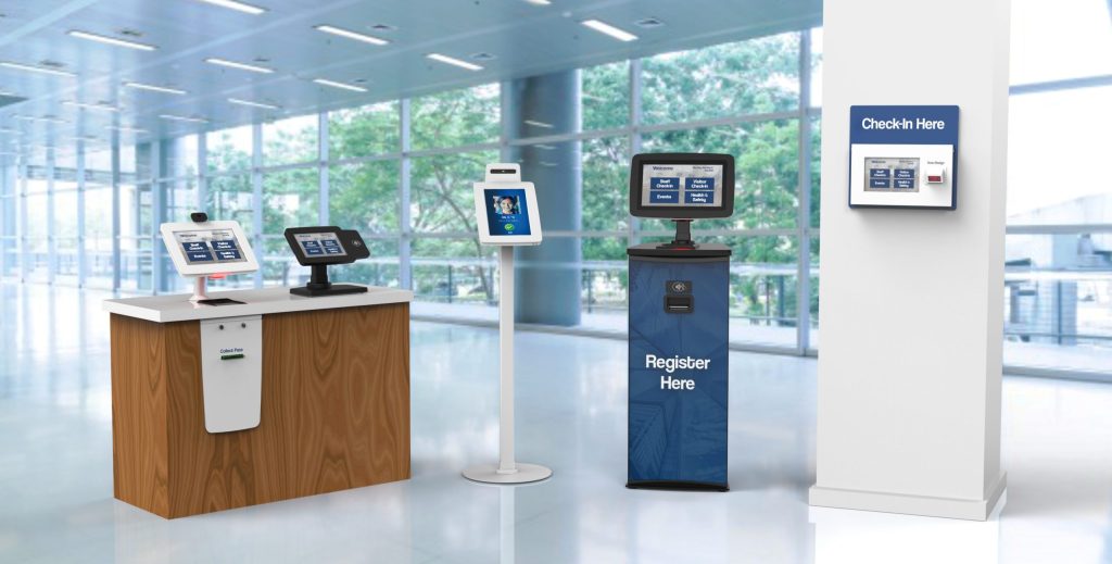
Building a kiosk app is not the same as building a regular iPad app. The users are different, the environment is different, and the stakes for a confusing interface are much higher when there is no one around to help.
Whether you are building for a restaurant, a hospital check in desk, or a retail environment, getting the UI and UX right is what separates a product people actually use from one they abandon after thirty seconds.
This guide walks through what that actually looks like in practice, starting from the software decisions that shape everything else.
Locking Down the Experience: Kiosk Mode Fundamentals
Before you design a single screen, you need to decide how the device itself will be managed. This is where iPad kiosk software development services begins, and getting it wrong creates problems no amount of good UI can fix.
Apple gives you three options depending on your scale and security requirements.
1. Guided Access
This is a built in accessibility feature that locks an iPad to a single app until a passcode is entered. It is fast to set up and costs nothing, which makes it useful for events or temporary deployments. The catch is that Guided Access ends if the iPad is force restarted or the battery dies, which makes it unsuitable for anything running unattended long term.
2. Single App Mode
This is a managed configuration that requires the iPad to be supervised and is applied either via Apple Configurator 2 or an MDM. The practical difference is persistence and control. Single App Mode survives reboots and keeps running through power cycles, which is what you need for a kiosk that lives in a lobby or on a shop floor for months at a time.
3. MDM
For 10 or more devices, multiple locations, or when you need remote control, MDM is the right call. It enables remote management, stronger security controls, and seamless scalability. Solutions like Hexnode, SureMDM, and EasyControl let you push updates, lock devices, and monitor your fleet without physically touching a single unit.
The decision framework is straightforward: Guided Access for temporary setups, Apple Configurator for small fixed deployments, MDM for anything at scale.
How to Design for Fingers, Not Cursors
Kiosk UIs are too often designed like desktop UIs. Kiosk software designers regularly work on the basis of screen size when designing rather than on the basis of interaction type, meaning fingers rather than a mouse. This is the single most common mistake in kiosk design and it shows up everywhere, tiny buttons, dense layouts, hover states that mean nothing on a touch screen.
Touch Target Sizing
Getting tap targets right is non negotiable. Here is what the numbers look like in practice:
- Minimum tap target size: 44×44 pixels, roughly 20mm on a touchscreen
- Minimum spacing between tappable elements: 5mm
- Hit area padding matters more than visual size. A button might look 36px tall, but if the tappable area extends to 44px with invisible padding, users will not miss it
- Build this into your component library from the start rather than retrofitting it later
Typography at Kiosk Scale
Font size follows the same logic as tap targets. Users are standing at varying distances from the display, not sitting six inches from a phone screen:
- Important text should sit at roughly 4mm height or more on screen
- On a 1080p 21 inch display that translates to roughly 20 to 24px font size
- Use high contrast between foreground and background at all times
- Never rely on color alone to communicate meaning, always pair it with an icon or labe
Navigation and Flow: Keep It Linear
Kiosk users are not power users on their own device. They are often first time visitors completing a specific task under mild time pressure, with a queue forming behind them. Your navigation structure needs to reflect that reality.
Structuring the User Journey
Keep flows short and linear. Every additional step is friction. Every decision point is a potential exit. When mapping your user journey from entry to task completion, cut anything that does not serve that path directly. A well designed kiosk flow typically follows this structure:
- Clear welcome screen with a single obvious call to action
- Short linear task steps with visible progress indicators
- Confirmation screen before any final action
- Success or completion screen with a clear session end
Session Management and Timeouts
How you handle inactivity is as important as the flow itself:
- Auto reset after 60 to 90 seconds of inactivity is standard for most deployments
- Always show a countdown warning before resetting, never surprise expire a session
- Each new session must start completely clean with zero residual data from the previous user
- Provide a visible session reset button that returns to the start in one tap
Error Handling and Feedback
Every interaction needs an immediate and visible response:
- Use plain language for all error messages, no system codes or technical jargon
- Offer undo or edit options before any final confirmation, especially for payments
- Loading states should be clearly communicated, a blank screen mid process will read as a crash to most users
Accessibility Is Not Optional
Unlike mobile apps or desktop interfaces, kiosk design must account for physical abilities and environmental constraints. Customers often engage with kiosks in public spaces, sometimes under pressure from queues forming behind them. Designing for accessibility is not just a compliance consideration. It is a usability consideration that improves the experience for everyone.
Visual and Motor Accessibility
- Avoid relying on color alone to communicate state, pair color with icons or labels
- Ensure sufficient color contrast ratio between all foreground and background elements
- Buttons and interactive elements should be reachable by users of different heights
- For public facing deployments, consider a wheelchair mode or adjustable UI height option
Interaction Accessibility
- Keep primary interactions to obvious button taps, not gestures
- Gesture support is appropriate for power users on familiar devices, not as a primary method on a public kiosk
- Where possible, support physical keyboard alternatives for users who cannot access the touch screen
- Auditory feedback through spoken instructions adds another accessibility layer with minimal development overhead
Language and Cognitive Accessibility
- Offer multilingual options with a clear language selection entry point
- Use short steps and predictable flows throughout
- Cognitive load should be minimal at every screen, one task, one decision, one action
Security and Session Management on the Software Side
The visual design of your kiosk is only part of the picture. The software layer underneath it carries significant security responsibility, particularly in environments handling payments or personal data.
Data and Payment Security
- Automatic session logout after inactivity is a baseline requirement, not an advanced feature
- Avoid collecting any personal data beyond what the task strictly requires
- If your kiosk handles payments, you need encryption in transit, no local storage of card data, and a compliant payment SDK
- PCI and PII compliance where applicable must be designed in from the start, not patched in before launch
Remote Monitoring and Health Signals
Your MDM solution can tell you when a device goes offline, but your app should be emitting its own health signals independently:
- Session flow breaks
- Peripheral failures such as a card reader going unresponsive
- Unexpected app states or crash loops
- Connectivity loss with graceful offline handling
Never let a connectivity issue produce a blank screen or a raw error state. Queue transactions locally, sync when connectivity is restored, and surface a clear message to users when the device is offline.
Testing: The Step Most Teams Skip
Testing with developers is a poor substitute for testing with real users. Developers know too much about the system to navigate it the way a first time user would. Recruit people who match your actual user demographic and watch them interact with the interface without assistance.
How to Test a Kiosk Interface Properly
- Recruit users who match your actual deployment demographic, not colleagues
- Give them a task and watch without assistance or guidance
- Note every moment of hesitation, hesitation is the earliest signal of UI ambiguity
- Run sessions in the actual physical environment, not a controlled office setting
What Environment Testing Surfaces
Testing in the real deployment space reveals problems that no lab test will catch:
- Screen glare and ambient lighting that make text illegible
- Noise levels that affect whether audio feedback is useful
- Social dynamics of a public space that change how quickly users move through flows
- Physical ergonomics around screen height and reach distance
What reads clearly on a monitor in a quiet office may be completely illegible on a screen in a sunlit retail space. Build real environment testing into your release cycle, not as a final check but as an ongoing feedback loop.
