Monochromatic Website Design: A Complete Guide to Simplicity and Impact
Introduction
In the ever-changing world of web design, some approaches stand the test of time. One such design philosophy is the monochromatic color scheme. Rather than relying on multiple contrasting colors, monochromatic websites focus on a single base color and explore its various shades, tones, and tints. When executed thoughtfully, this technique delivers a visually cohesive experience that feels modern, elegant, and purposeful.
This guide explores what monochromatic web design is, why designers choose it, its advantages and limitations, and practical tips for creating an effective monochromatic website.
What Is a Monochromatic Website?
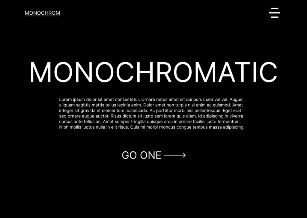
A monochromatic website is built using one dominant color and its variations. These variations are created by adjusting brightness, saturation, or intensity, resulting in lighter tints, darker shades, and softer tones of the same hue.
For example, a blue-based monochromatic site may feature pale blues for backgrounds, rich navy tones for headers, and muted steel blue for secondary elements. This layered use of a single color creates visual depth while maintaining design consistency.
Why Designers Choose Monochromatic Color Schemes
1. Consistent Visual Identity
Using one color throughout a website creates instant harmony. The design feels unified, making it easier for users to navigate without visual overload.
2. Clean and Elegant Appearance
Monochromatic designs naturally lean toward minimalism. By eliminating the challenge of coordinating multiple colors, designers achieve a refined and sophisticated aesthetic.
3. Strong Brand Recall
A dominant color reinforces brand identity. Many successful brands use monochromatic elements so users can recognize them immediately, even without logos or text.
4. Clear User Focus
With fewer color distractions, attention is naturally drawn to key elements such as headlines, buttons, and important messages.
Advantages of Monochromatic Web Design
Reduced Visual Noise
A limited palette keeps the interface calm and uncluttered, improving content readability and user engagement.
Faster Design Decisions
Designers can spend less time choosing colors and more time refining layout, typography, and usability.
Long-Lasting Design Appeal
Monochromatic websites rarely feel outdated. Whether modern or classic, they age gracefully compared to overly colorful trends.
Mobile-Friendly Experience
Simplicity and clarity make monochromatic layouts especially effective on smaller screens, enhancing mobile usability.
Challenges to Consider
Risk of a Flat Look
Without thoughtful variation, a single-color design may feel dull. Strategic contrast and visual hierarchy are essential.
Limited Emotional Expression
Different colors evoke different emotions. Relying on one hue may restrict the emotional range of the design.
Accessibility Issues
Poor contrast between text and background can impact readability, especially for users with visual impairments. Accessibility must be prioritized.
Best Practices for Monochromatic Website Design
1. Select the Right Core Color
Choose a color that reflects the brand’s personality and purpose. Blue suggests trust, green implies sustainability, and black communicates luxury.
2. Use Color Variations Strategically
Mix light, medium, and dark variations of the same color to create depth and visual structure.
3. Introduce Texture and Layers
Subtle gradients, patterns, or background textures can add richness without breaking the monochromatic theme.
4. Emphasize Typography
Typography becomes a key design element. Use font size, weight, and spacing creatively to guide users through the content.
5. Maintain Strong Contrast
Ensure text and interactive elements stand out clearly from their backgrounds for readability and usability.
6. Add Motion Thoughtfully
Micro-interactions, hover effects, and smooth transitions can bring life to a monochromatic layout.
7. Design with Accessibility in Mind
Test color contrast ratios and follow accessibility guidelines to ensure inclusivity for all users.
Real-World Examples of Monochromatic Design
Spotify for Artists uses varying shades of green to maintain brand consistency while clearly highlighting important actions.
Dropbox applies a blue-based palette with subtle contrasts to deliver a calm, professional interface.
Creative Portfolios often rely on monochromatic schemes to keep attention focused on work rather than decorative elements.
Conclusion
Monochromatic web design proves that simplicity can be powerful. By exploring the full potential of a single color, designers can create websites that are cohesive, elegant, and highly effective. While this approach requires careful planning to avoid monotony or accessibility issues, the results can be both visually striking and user-friendly.
From personal portfolios to corporate platforms, monochromatic websites demonstrate that thoughtful restraint often leads to the strongest visual impact. As design trends continue to evolve, this timeless style remains a reliable and creative choice.
