The Origins of Neomorphism: How a Modern Design Trend Was Born
Digital design is constantly evolving. What looks modern today may feel outdated tomorrow. Yet, some styles manage to leave a strong impression and shape the future of interface design. One such trend is neomorphism — a visual style that brings together simplicity and subtle realism.
To truly understand why designers love neomorphism, it’s important to look at where it came from and how it developed over time.
What Exactly Is Neomorphism?
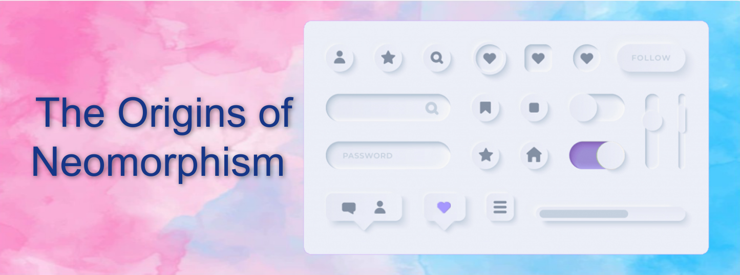
Neomorphism, also called new skeuomorphism, is a design approach that creates soft, realistic UI elements using gentle shadows, smooth gradients, and light highlights. Buttons, cards, and icons appear slightly raised or pressed into the background, giving the interface a calm, tactile feel.
Unlike older realistic designs that used heavy textures and complex graphics, neomorphism keeps everything clean and minimal. The goal is to create depth without visual clutter, resulting in a modern and elegant look.
The Design Journey That Led to Neomorphism
Neomorphism didn’t appear overnight. It evolved naturally as designers experimented with different visual styles over the years.
1. The Skeuomorphic Phase
In the early days of mobile apps and desktop software, designers tried to mimic real-world objects. Digital calendars looked like paper planners, music apps resembled physical players, and buttons appeared three-dimensional. This made interfaces easy to understand for new users, but the designs often felt heavy and visually busy.
2. The Rise of Flat Design
As technology matured, simplicity became the priority. Flat design removed unnecessary textures, shadows, and decorative effects. Bright colors, clean typography, and simple layouts dominated the screen. While this approach improved speed and clarity, many users felt that flat interfaces lacked depth and visual personality.
3. The Birth of Neomorphism
Around 2019, designers began searching for a middle ground. They wanted the clarity of flat design but missed the sense of dimension and interaction. This led to the emergence of neomorphism — a style that adds soft shadows and subtle depth while keeping layouts minimal and modern.
This balanced approach quickly gained attention in UI communities, especially for dashboards, mobile apps, and concept designs.
Why Designers Embraced Neomorphism
Several factors contributed to its growing popularity:
Modern Visual Appeal: The soft lighting and smooth surfaces feel fresh and futuristic.
Sense of Interaction: Raised and pressed effects make buttons feel touch-friendly and engaging.
Design Innovation: It offered something new at a time when flat layouts were becoming repetitive.
Minimal Yet Stylish: Clean layouts with depth create a premium look without complexity.
Final Thoughts
Neomorphism represents the natural evolution of digital design — combining the realism of skeuomorphism with the clarity of flat design. It shows how design trends build upon each other rather than replacing the past completely.
As interfaces continue to evolve, neomorphism reminds designers that balance is key: usability, simplicity, and visual appeal must work together to create meaningful user experiences.
